Korail, the Korea Railroad Corporation, is the national railway operator in South Korea, providing extensive rail services including high-speed KTX trains, regional services, and commuter lines.
Korail, the Korea Railroad Corporation, is the national railway operator in South Korea, providing extensive rail services including high-speed KTX trains, regional services, and commuter lines.
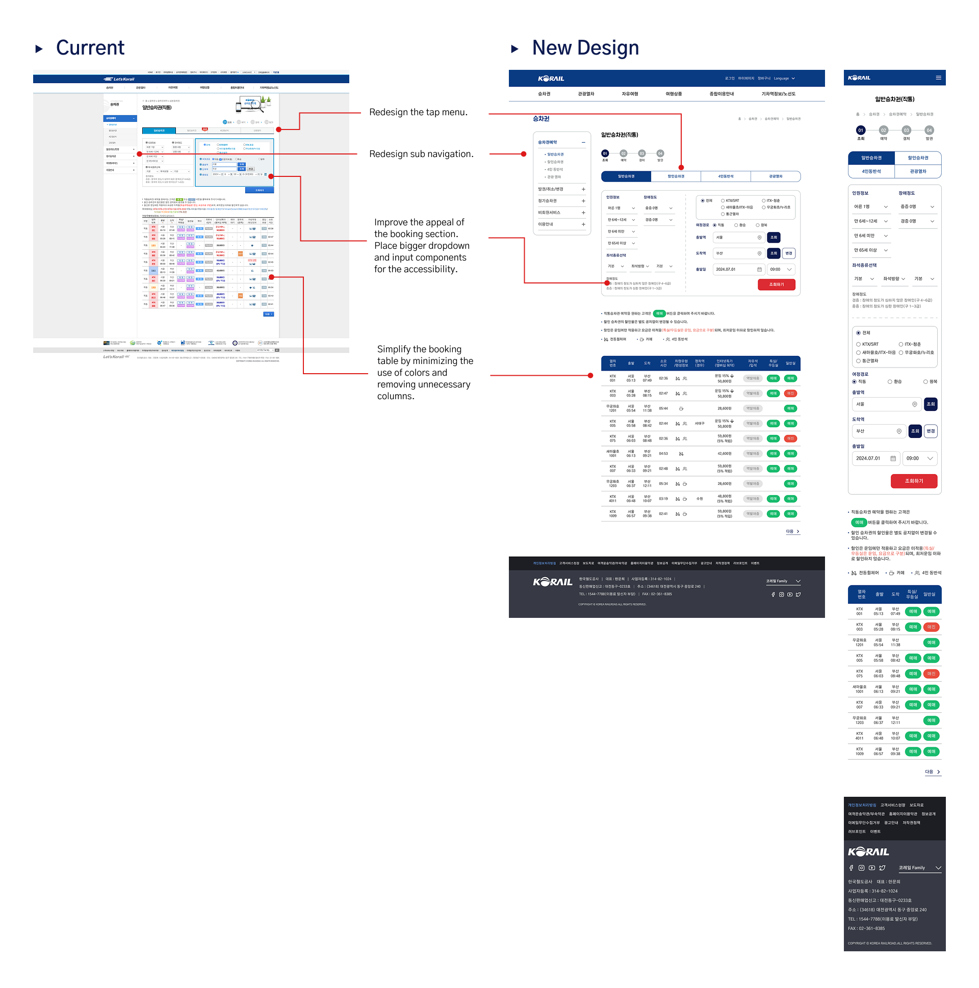
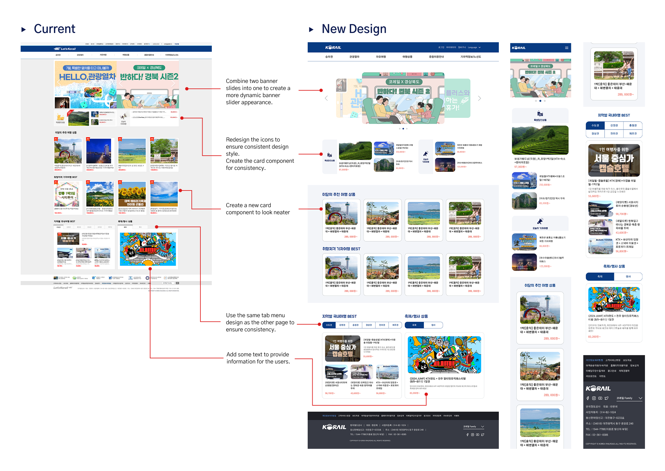
The Korail website has an outdated design that hasn't been visually or functionally updated for years. It lacks responsiveness across different screen sizes, which make it difficult to use on mobile or tablets. Additionally, the main page uses a three-column layout that creates visual clutter and causes confusion for users trying to navigate the site.
The Korail website has an outdated design that hasn't been visually or functionally updated for years. It lacks responsiveness across different screen sizes, which make it difficult to use on mobile or tablets. Additionally, the main page uses a three-column layout that creates visual clutter and causes confusion for users trying to navigate the site.


The Korail website has an outdated design that hasn't been visually or functionally updated for years. It lacks responsiveness across different screen sizes, which make it difficult to use on mobile or tablets. Additionally, the main page uses a three-column layout that creates visual clutter and causes confusion for users trying to navigate the site.
The Korail website has an outdated design that hasn't been visually or functionally updated for years. It lacks responsiveness across different screen sizes, which make it difficult to use on mobile or tablets. Additionally, the main page uses a three-column layout that creates visual clutter and causes confusion for users trying to navigate the site.
The Korail website has an outdated design that hasn't been visually or functionally updated for years. It lacks responsiveness across different screen sizes, which make it difficult to use on mobile or tablets. Additionally, the main page uses a three-column layout that creates visual clutter and causes confusion for users trying to navigate the site.
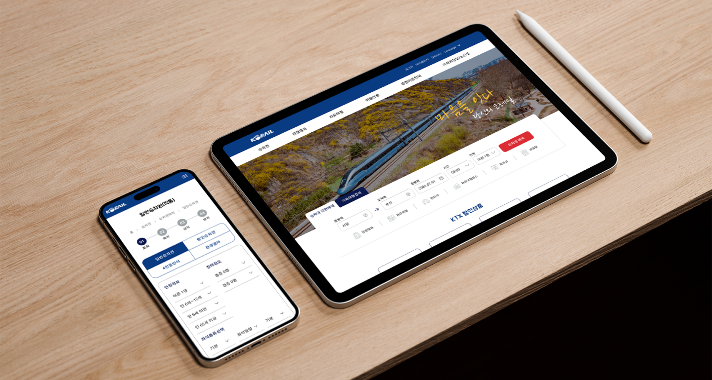
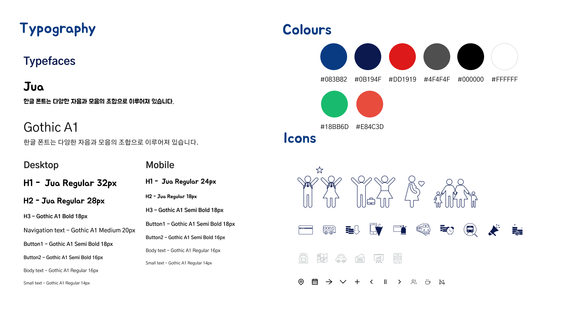
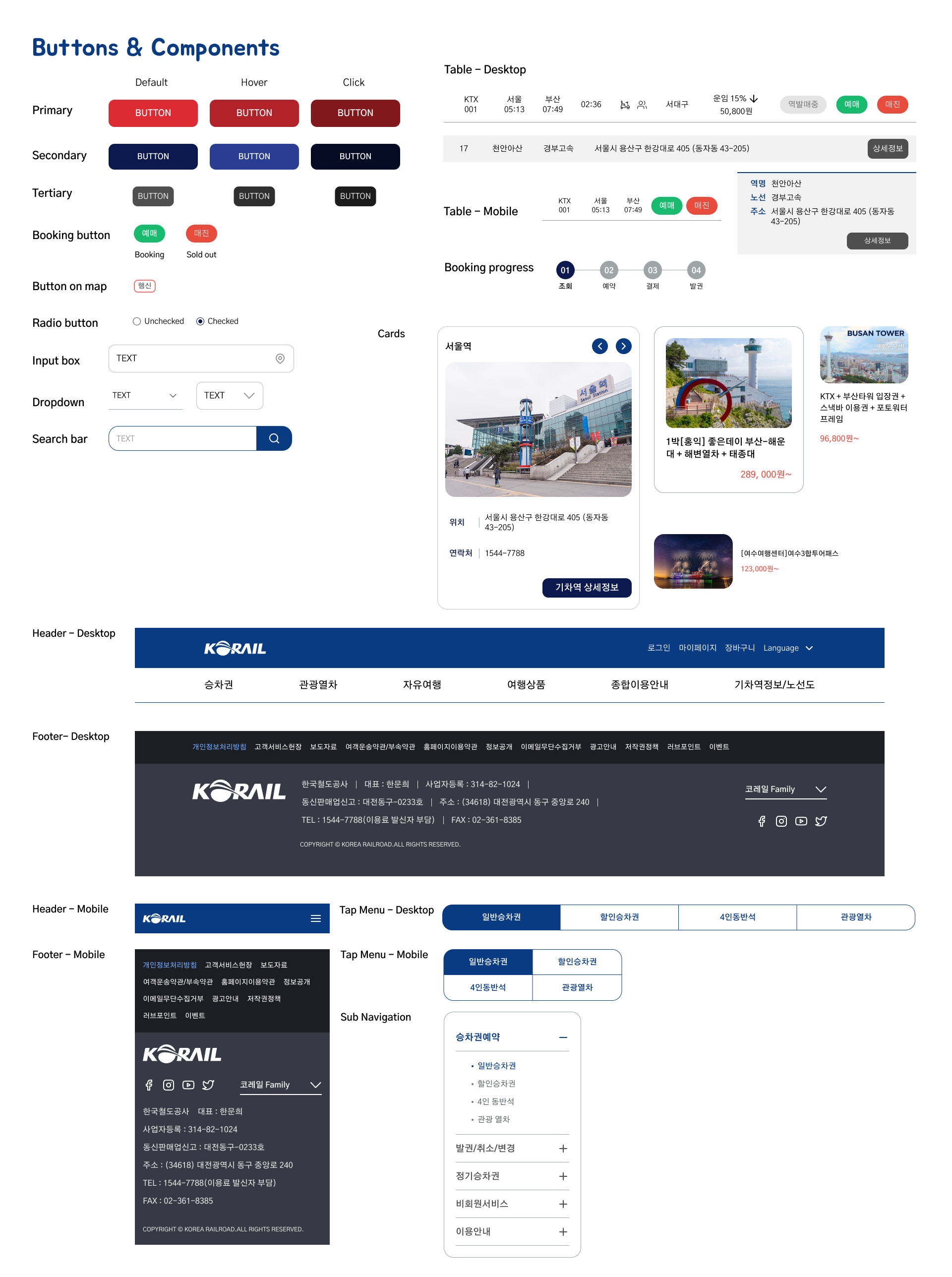
The goal of this study was to improve the overall UI of the Korail website from typography and color palette to individual components. I also created a responsive layout for mobile devices to enhance accessibility across screens. Through the redesign, the website was given a more modern and user-friendly look and feel.
The Korail website has an outdated design that hasn't been visually or functionally updated for years. It lacks responsiveness across different screen sizes, which make it difficult to use on mobile or tablets. Additionally, the main page uses a three-column layout that creates visual clutter and causes confusion for users trying to navigate the site.
The Korail website has an outdated design that hasn't been visually or functionally updated for years. It lacks responsiveness across different screen sizes, which make it difficult to use on mobile or tablets. Additionally, the main page uses a three-column layout that creates visual clutter and causes confusion for users trying to navigate the site.
The Korail website has an outdated design that hasn't been visually or functionally updated for years. It lacks responsiveness across different screen sizes, which make it difficult to use on mobile or tablets. Additionally, the main page uses a three-column layout that creates visual clutter and causes confusion for users trying to navigate the site.
The goal of this study was to improve the overall UI of the Korail website from typography and color palette to individual components. I also created a responsive layout for mobile devices to enhance accessibility across screens. Through the redesign, the website was given a more modern and user-friendly look and feel.
The Korail website has an outdated design that hasn't been visually or functionally updated for years. It lacks responsiveness across different screen sizes, which make it difficult to use on mobile or tablets. Additionally, the main page uses a three-column layout that creates visual clutter and causes confusion for users trying to navigate the site.
The goal of this study was to improve the overall UI of the Korail website from typography and color palette to individual components. I also created a responsive layout for mobile devices to enhance accessibility across screens. Through the redesign, the website was given a more modern and user-friendly look and feel.