PeekaBite is a mobile application that lets health-conscious users scan packaged foods for quick nutrition info and personalized health tips.
I contributed to both UI and UX design, starting from primary research and user interviews to developing low-to high-fidelity screens, with a particular focus on the profile setup flow. I also created the app's mascot and its animations, and designed key UI components such as buttons, navigation, and input forms.
PeekaBite is a mobile application that lets health-conscious users scan packaged foods for quick nutrition info and personalized health tips.
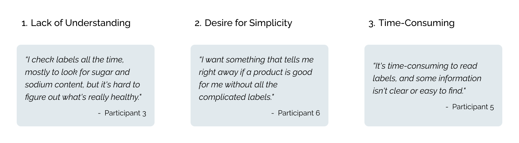
Many consumers find nutrition labels overwhelming, confusing, or time-consuming to interpret. While they frequently check for sugar, calories, and fat, understanding hidden risks or broader nutritional profiles is difficult.
Consumers are increasingly seeking clear and transparent health information about the food they eat. While basic nutrition labels are available, most existing tools fall short of meeting this need. People want trustworthy, easy-to-understand solutions that reveal hidden health concerns like additives, contaminants, and questionable production practices. This creates an opportunity to design a user-centered experience that makes complex food data more accessible, understandable, and trustworthy, empowering users to make informed choices with confidence.
We conducted user interviews with individuals who have concerns about food due to reasons such as dieting, allergies, or dietary restrictions. From these interviews, we uncovered three key insights:
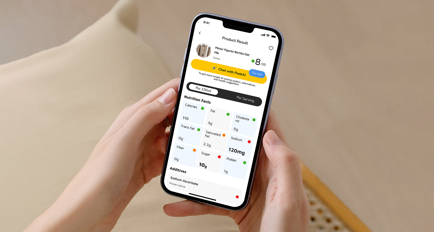
PeekaBite offers health-conscious consumers a mobile app that delivers instant nutritional information and personalized health insights. By simply interacting with the product packaging, users can quickly understand what they’re eating and discover better choices. The app is designed around three core features that make informed food decisions easier and more accessible.

Many consumers find nutrition labels overwhelming, confusing, or time-consuming to interpret. While they frequently check for sugar, calories, and fat, understanding hidden risks or broader nutritional profiles is difficult.
PeekaBite offers health-conscious consumers a mobile app that delivers instant nutritional information and personalized health insights. By simply interacting with the product packaging, users can quickly understand what they’re eating and discover better choices. The app is designed around three core features that make informed food decisions easier and more accessible.
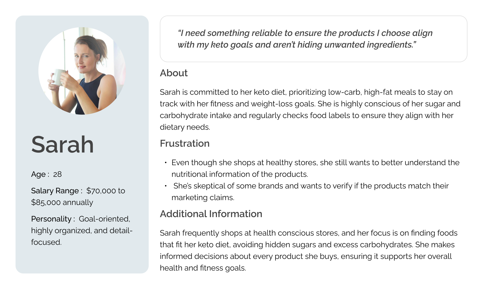
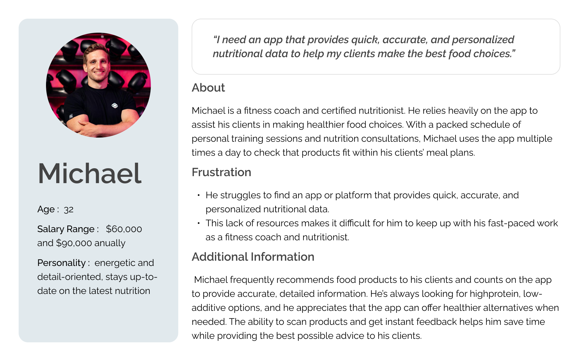
Through market research and user interviews, we defined our target audience and created user personas to better understand their needs, experiences, behaviors, and goals.
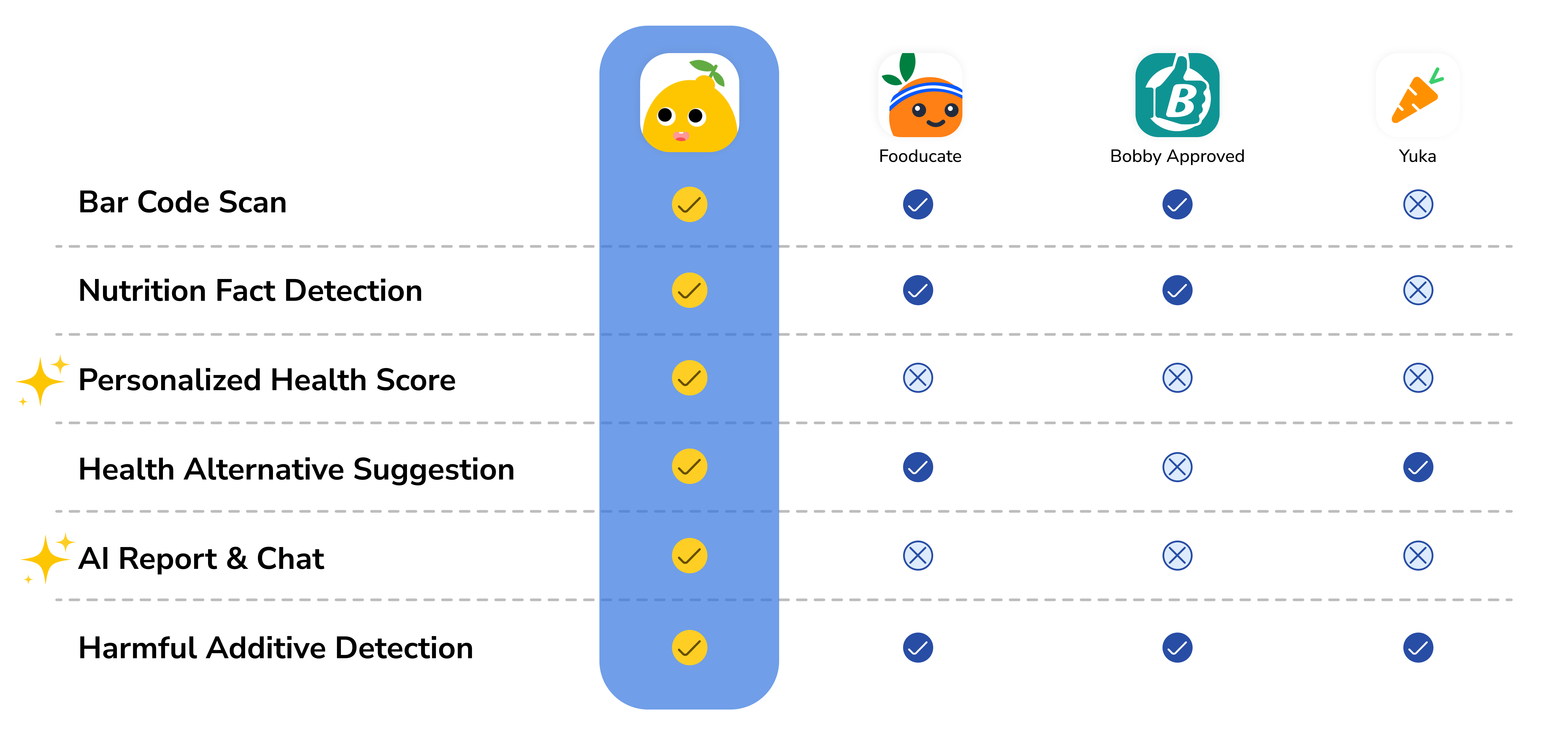
Based on our findings, we pinpointed the unique features that distinguish PeekaBite from other similar products.
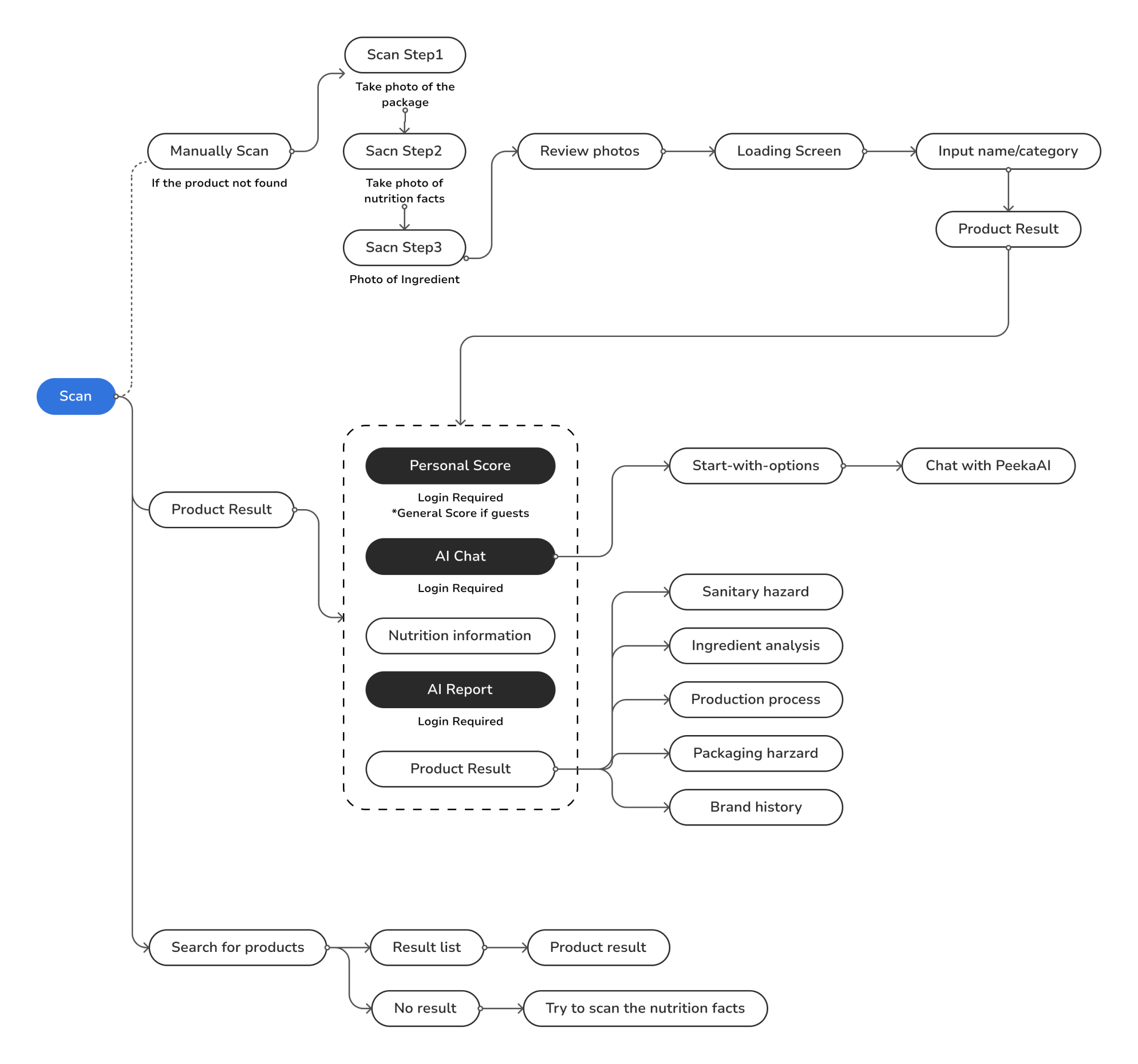
After conducting research and analysis, we shifted our focus to translating key features into the app experience. Before moving into wireframing, we made a user flow to walk through the main actions users would take. The flow below illustrates the core feature that how user access product information after scanning.
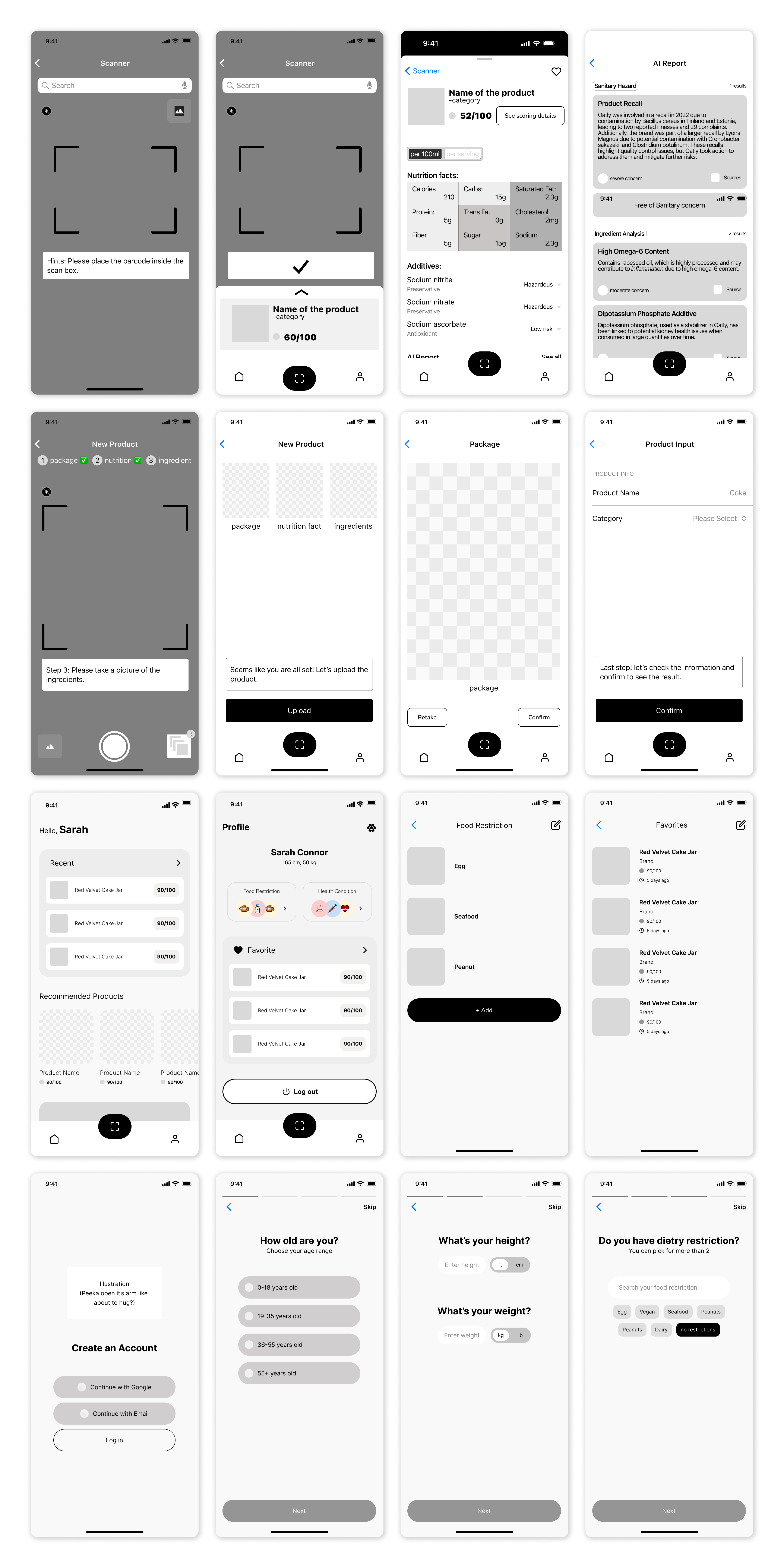
Once the user flow was defined, we transitioned into the design phase by creating wireframes. These mid-fidelity layouts helped us visualize how each screen would deliver key features while keeping the overall experience simple and intuitive. Our goal was to ensure that users could easily navigate the app and access essential information without friction.
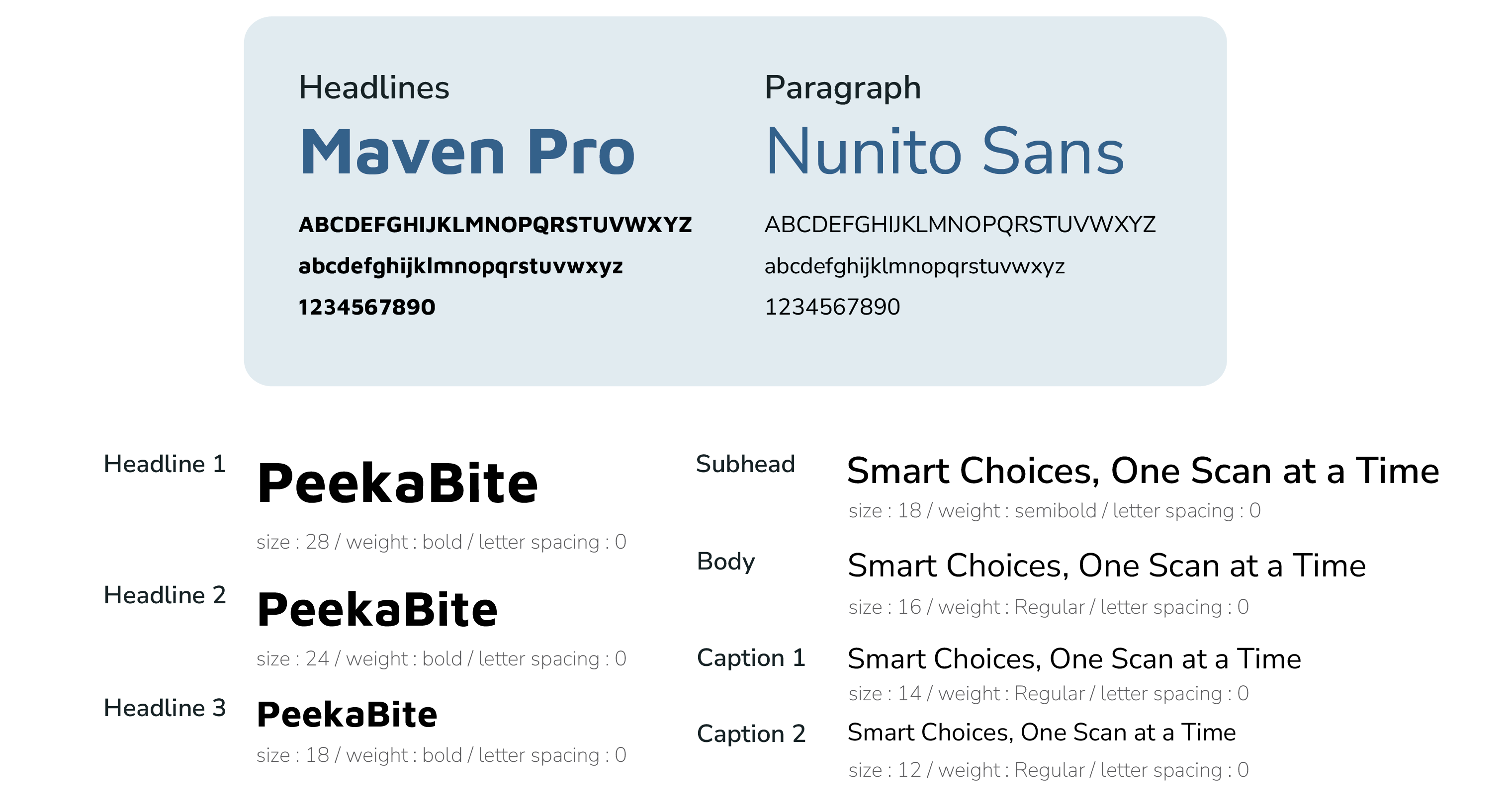
Before creating the high-fidelity prototype, we focused on designing a clean and user-friendly UI to ensure that the app would be easy to use. To maintain consistency in visuals and content across the team, we first built a style guide. This guide included key design elements such as the color palette, typography, UI components, and brand assets like the logo and mascot character.
To make the app feel more engaging and approachable, we also brainstormed as a team to create a mascot that could guide users through out the app. After several discussions, we decided on a lemon character for its fresh, healthy image, which also visually reflects the brand's identity.


Many consumers find nutrition labels overwhelming, confusing, or time-consuming to interpret. While they frequently check for sugar, calories, and fat, understanding hidden risks or broader nutritional profiles is difficult.
Consumers are increasingly seeking clear and transparent health information about the food they eat. While basic nutrition labels are available, most existing tools fall short of meeting this need. People want trustworthy, easy-to-understand solutions that reveal hidden health concerns like additives, contaminants, and questionable production practices. This creates an opportunity to design a user-centered experience that makes complex food data more accessible, understandable, and trustworthy, empowering users to make informed choices with confidence.
We conducted user interviews with individuals who have concerns about food due to reasons such as dieting, allergies, or dietary restrictions. From these interviews, we uncovered three key insights:
PeekaBite offers health-conscious consumers a mobile app that delivers instant nutritional information and personalized health insights. By simply interacting with the product packaging, users can quickly understand what they’re eating and discover better choices. The app is designed around three core features that make informed food decisions easier and more accessible.
Many consumers find nutrition labels overwhelming, confusing, or time-consuming to interpret. While they frequently check for sugar, calories, and fat, understanding hidden risks or broader nutritional profiles is difficult.
Before creating the high-fidelity prototype, we focused on designing a clean and user-friendly UI to ensure that the app would be easy to use. To maintain consistency in visuals and content across the team, we first built a style guide. This guide included key design elements such as the color palette, typography, UI components, and brand assets like the logo and mascot character.
To make the app feel more engaging and approachable, we also brainstormed as a team to create a mascot that could guide users through out the app. After several discussions, we decided on a lemon character for its fresh, healthy image, which also visually reflects the brand's identity.
Many consumers find nutrition labels overwhelming, confusing, or time-consuming to interpret. While they frequently check for sugar, calories, and fat, understanding hidden risks or broader nutritional profiles is difficult.
Consumers are increasingly seeking clear and transparent health information about the food they eat. While basic nutrition labels are available, most existing tools fall short of meeting this need. People want trustworthy, easy-to-understand solutions that reveal hidden health concerns like additives, contaminants, and questionable production practices. This creates an opportunity to design a user-centered experience that makes complex food data more accessible, understandable, and trustworthy, empowering users to make informed choices with confidence.
We conducted user interviews with individuals who have concerns about food due to reasons such as dieting, allergies, or dietary restrictions. From these interviews, we uncovered three key insights:
PeekaBite offers health-conscious consumers a mobile app that delivers instant nutritional information and personalized health insights. By simply interacting with the product packaging, users can quickly understand what they’re eating and discover better choices. The app is designed around three core features that make informed food decisions easier and more accessible.
Many consumers find nutrition labels overwhelming, confusing, or time-consuming to interpret. While they frequently check for sugar, calories, and fat, understanding hidden risks or broader nutritional profiles is difficult.
PeekaBite offers health-conscious consumers a mobile app that delivers instant nutritional information and personalized health insights. By simply interacting with the product packaging, users can quickly understand what they’re eating and discover better choices. The app is designed around three core features that make informed food decisions easier and more accessible.
Many consumers find nutrition labels overwhelming, confusing, or time-consuming to interpret. While they frequently check for sugar, calories, and fat, understanding hidden risks or broader nutritional profiles is difficult.
Many consumers find nutrition labels overwhelming, confusing, or time-consuming to interpret. While they frequently check for sugar, calories, and fat, understanding hidden risks or broader nutritional profiles is difficult.